Designing Trust: Paymob's New Onboarding Flow
Problem
As Paymob expanded into the UAE, its previously streamlined 3-step onboarding flow, originally designed for a single market, no longer met regulatory and compliance requirements. The UAE required more detailed business and personal documentation, turning a quick process into a longer, more complex one.
Without context or clarity, users were left confused about why so many documents were needed. This led to drop-offs, incorrect submissions, and increased support queries.
Solution
To meet UAE requirements without overwhelming users, we redesigned the onboarding flow to be longer but more transparent.
Each step was carefully broken down to show only what was necessary at that point, paired with clear, friendly explanations about why each document or piece of information was required. A conversational tone and progress indicators helped users feel supported and in control throughout the journey.
My Approach
I began by leading a workshop with key stakeholders to understand the specifics of UAE onboarding, especially what needed to be uploaded versus entered as text.
From there, I categorized the requirements based on submission type and worked closely with design to restructure the flow around these groupings. This helped reduce visual clutter and cognitive load by giving each requirement its own dedicated space.
I rewrote the microcopy to sound reassuring, respectful, and human. Each message aimed to reduce uncertainty and build trust. It guided users clearly from one step to the next, making a longer flow feel easier, not harder.
Case Study Quick Facts
- Project: Onboarding Flow Redesign
- Company: Paymob
- Industry: FinTech (Mobile Payments)
- Team: Lead Product Designer, Product Manager, Head of App, Engineerings
- My Role: Content Designer: Led content strategy, UX writing, and facilitated alignment workshops for the onboarding flow
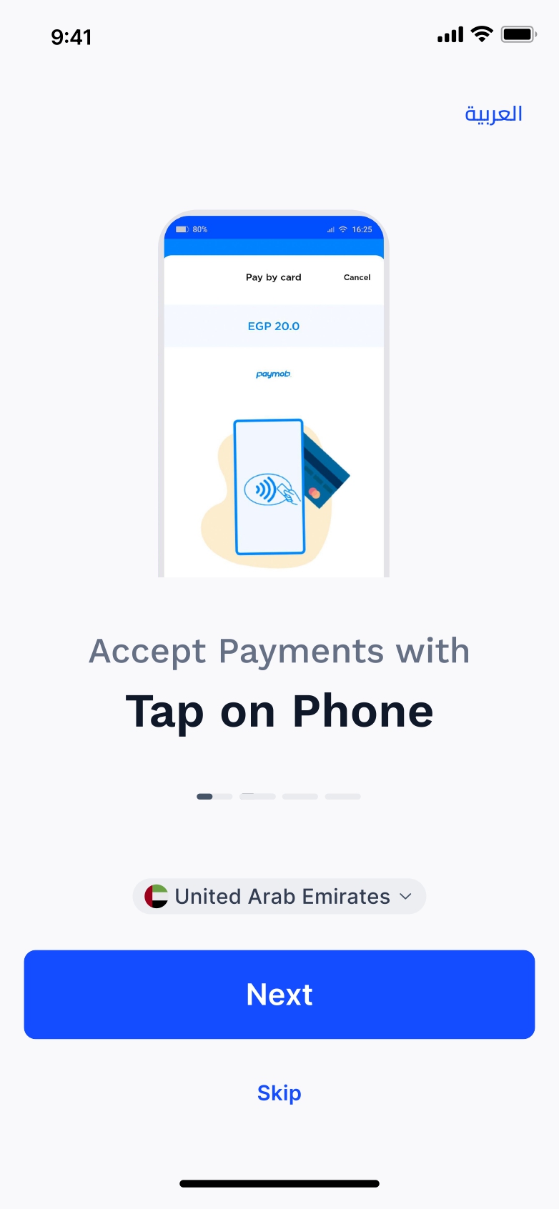
Old Pre-Onboarding Screens
The existing pre-onboarding carousel was too long and content-heavy, yet still didn’t provide a clear overview of all app offerings.
As Paymob’s services expanded, it became clear that the current content wasn’t scalable or future-proof. We needed a more concise, flexible way to introduce the platform’s value without overwhelming users.
New Pre-Onboarding Screens
The updated content takes a more generalized approach, giving users a clear overview without going too deep too soon.
Subheaders offer additional context where needed, and the tone was rewritten to be more conversational and friendly—aligning with the rest of the onboarding experience.
Key Frames in Old Onboarding Flow
The previous onboarding flow was a much simpler journey. It lacked context around why documents were needed, and verification was almost instant, with little to no wait time after submission.
While this worked for a single market, it didn’t scale with Paymob’s regional expansion. As more countries were added, the process became longer and required additional steps and documentation, making the original experience no longer fit for purpose.

Ideating for New Onboarding Flow
A key challenge in the onboarding revamp was introducing a broader set of documents for merchant verification. What was once a simple process with just a National ID and bank details now required more detailed business and ownership information, depending on the country.
I led a brainstorming session with the lead Product Designer to map out a clear information architecture. We grouped documents logically and designed the flow to guide users step by step.
The focus was on transparency. We wanted users to understand not just what we needed, but why, so the new process felt clear and manageable.
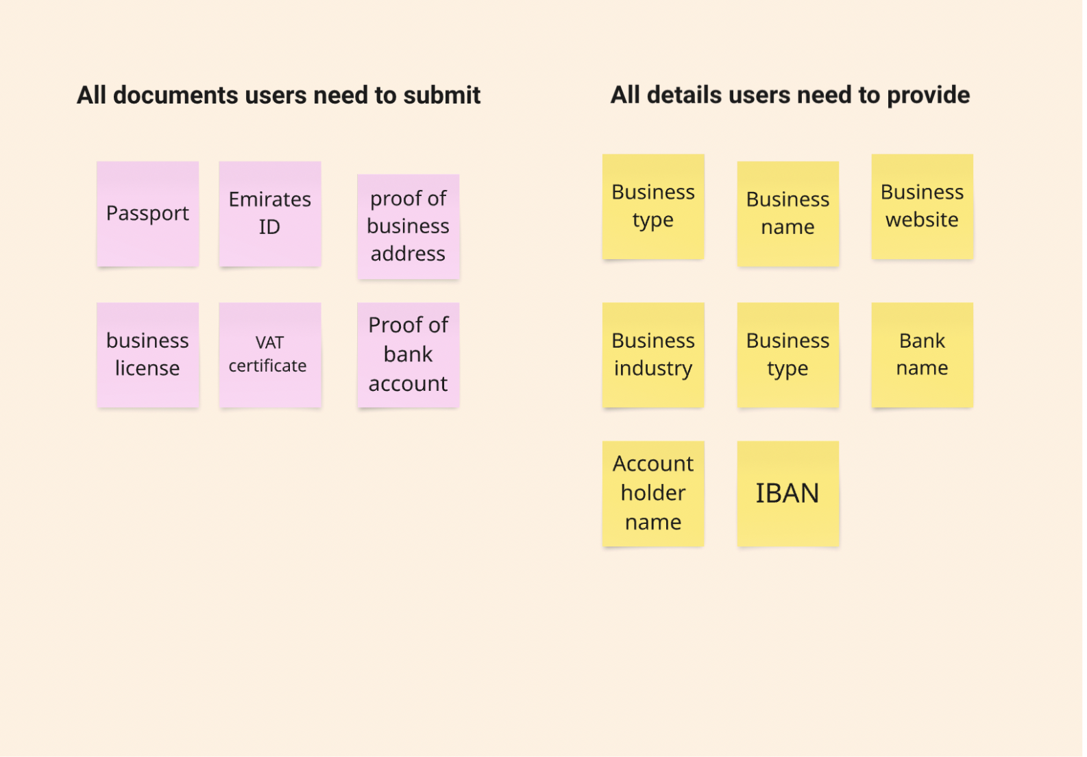
Our first step was to organize the list of requirements into two categories: those that needed uploaded documents, and those that could be submitted as text.
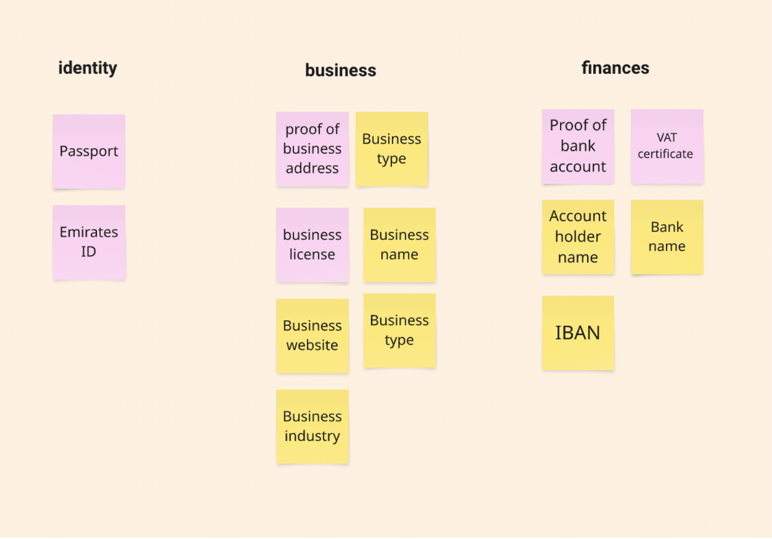
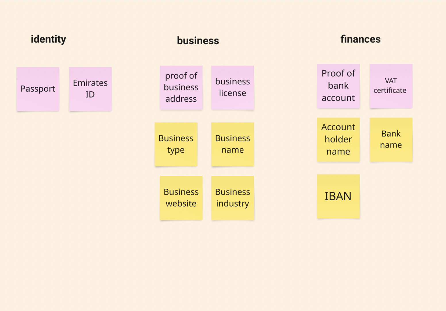
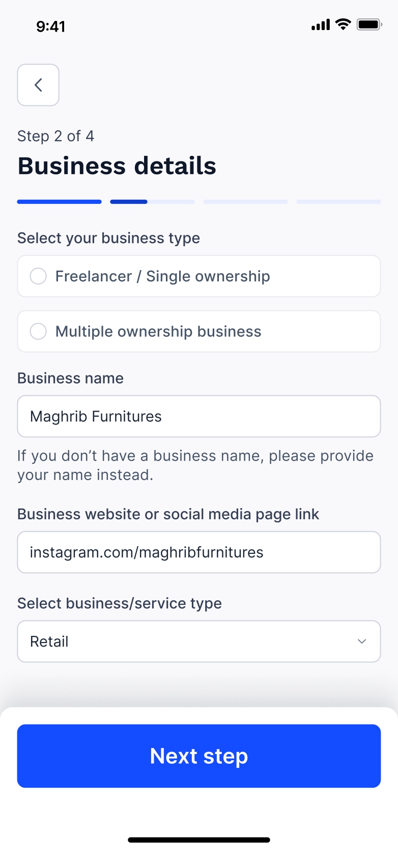
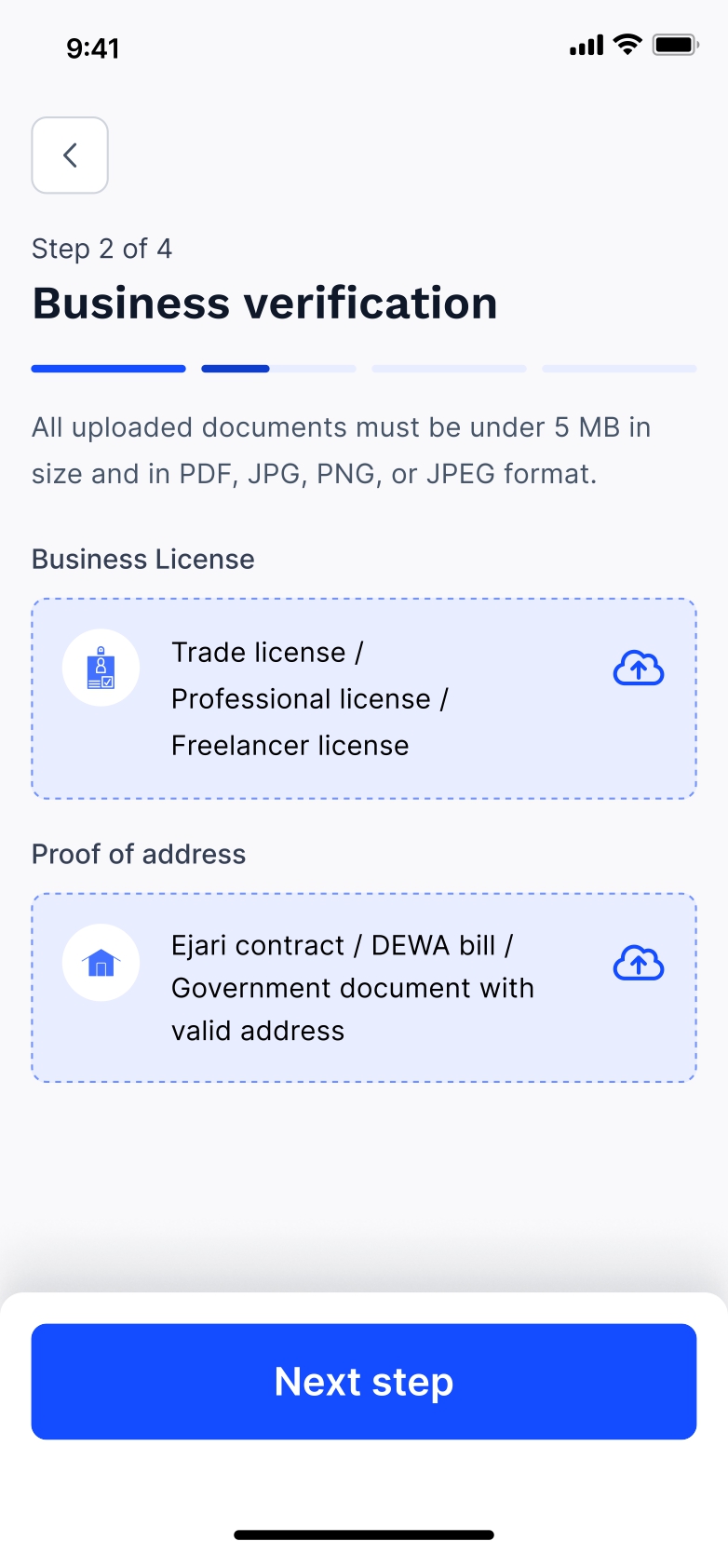
We organized the requirements into three categories: identity, business, and finances, with a mix of text inputs and document uploads. To ease users into the flow, we led with text inputs, reducing early friction before requesting documents.
Instead of separating steps, we designed the flow to collect details and their supporting documents side by side. This approach provided immediate context, helping users understand how the information they entered related to the documents they needed to upload. For example, entering a business name or registration number made the request for a trade license feel more logical and purposeful, reinforcing clarity and continuity throughout the process.
New Onboarding Flow
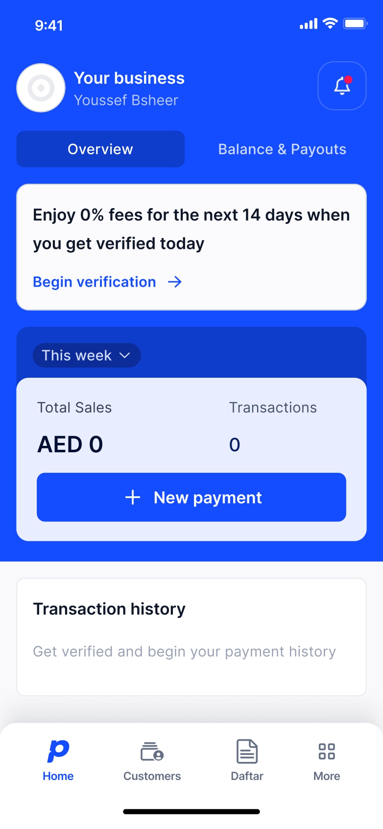
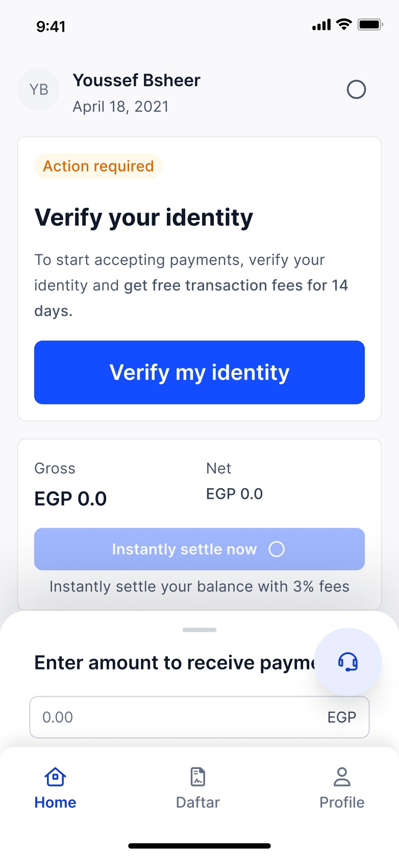
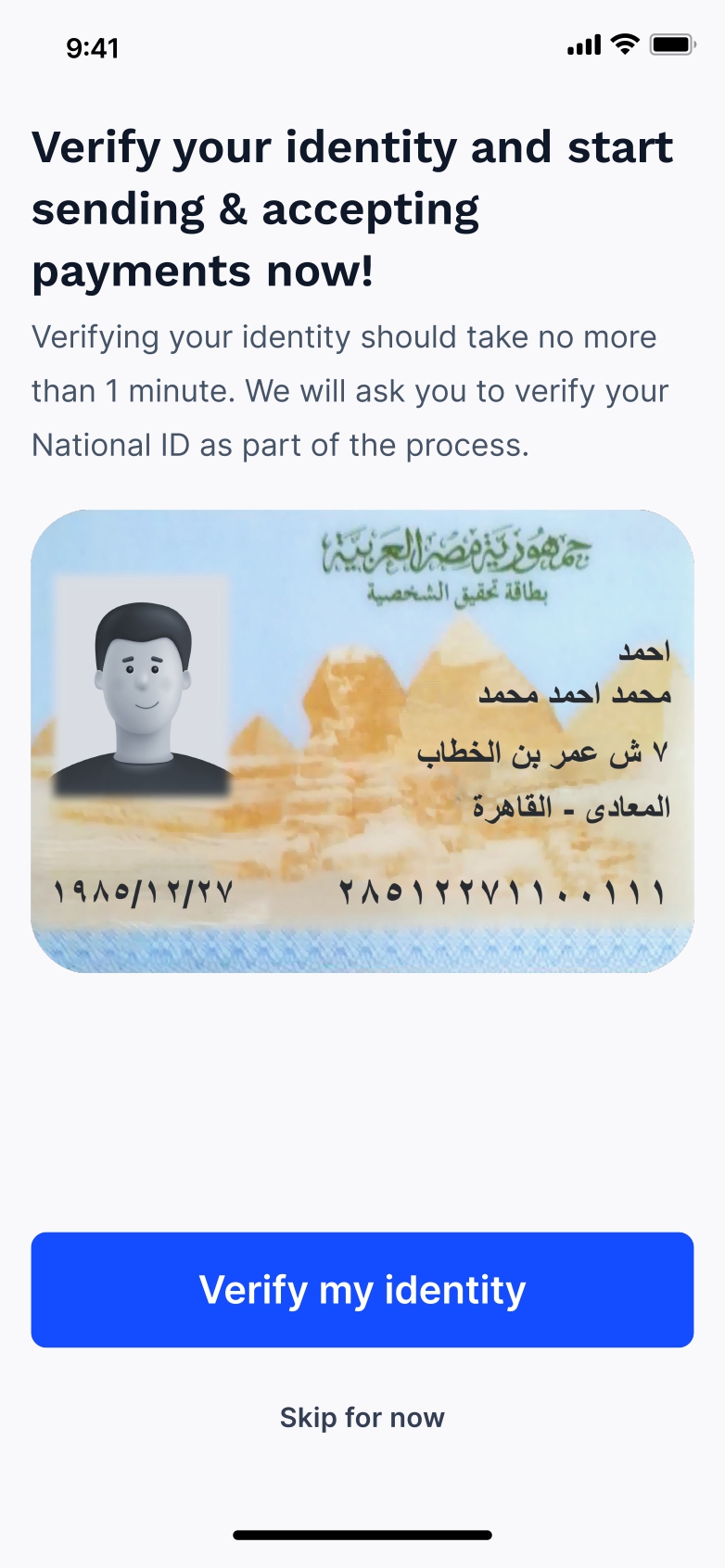
Entry way for users to begin verification. Since they're unverified, they have to face many limitations within the app. They are prompted with an incentive.

A pop-up appears when users try to access features that are restricted to verified accounts, prompting them to complete the verification process.
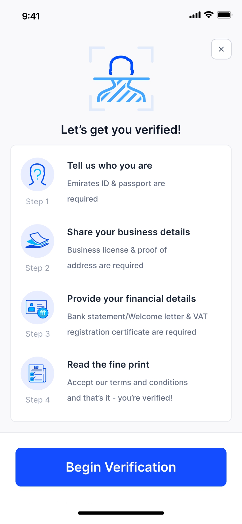
When they begin their verification journey, users are given an overview of the documents required. This helps reduce drop-offs and ensures they enter the flow aware that multiple steps and documents will be needed.
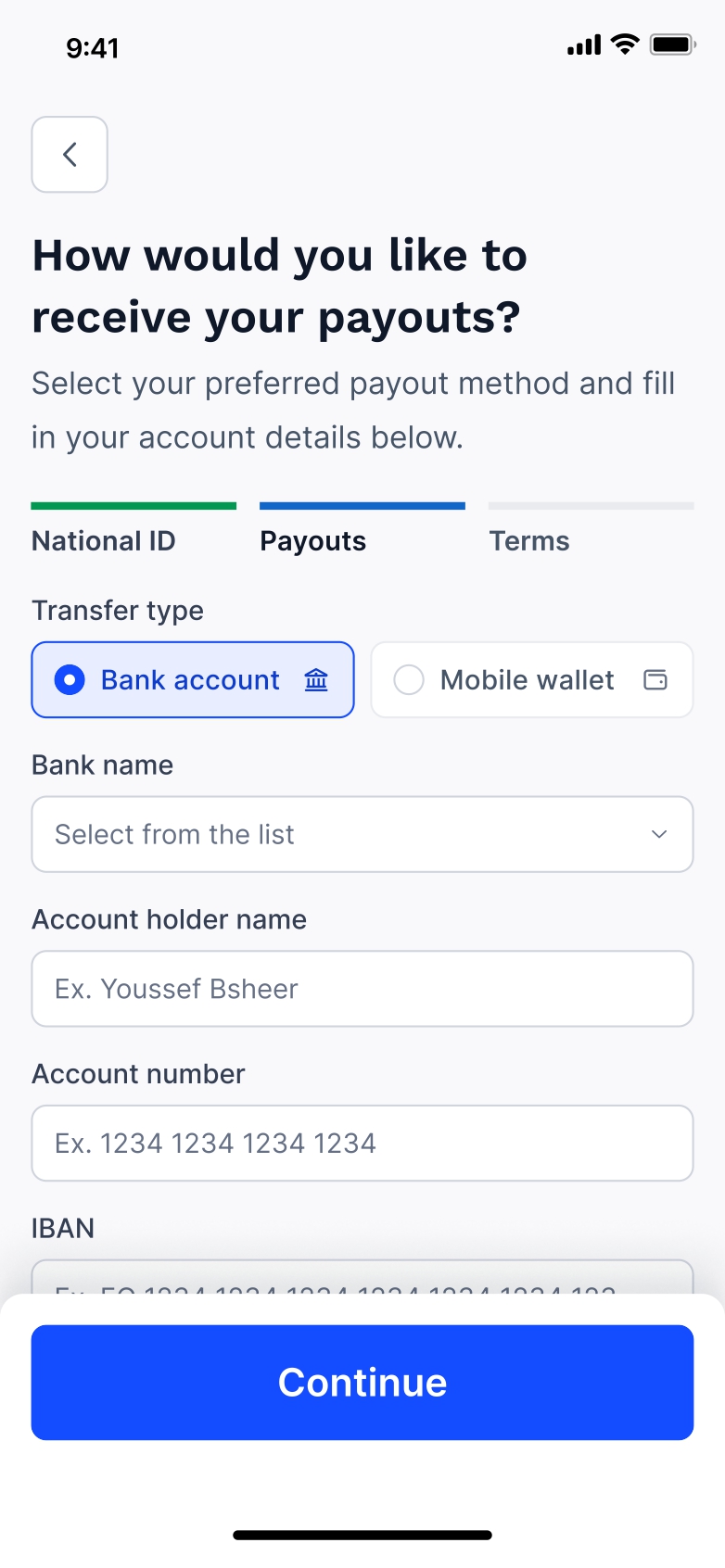
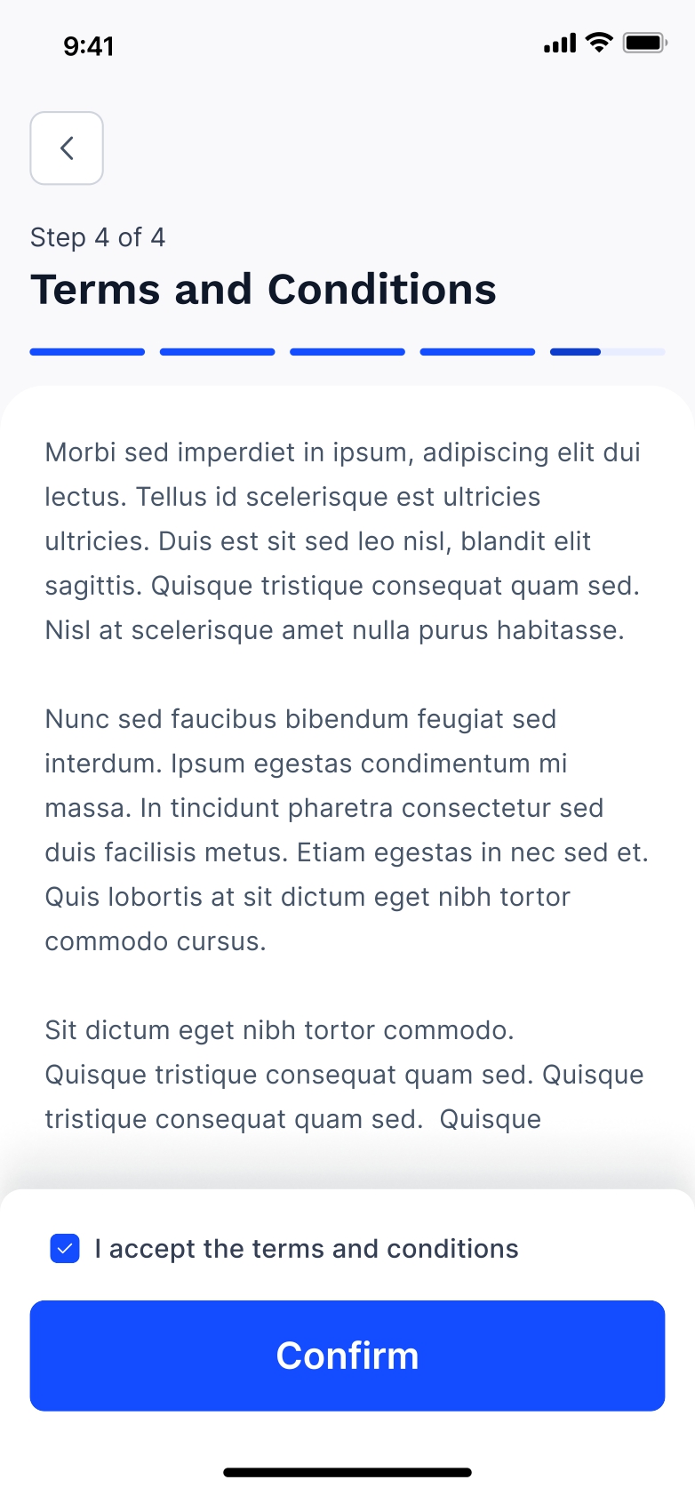
A progress bar is added to keep users aware of how much of the journey remains. Requirements are displayed on the top bar, with clear labels and accessible language to prevent confusion as users navigate the new flow.
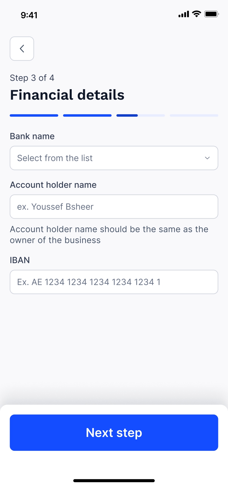
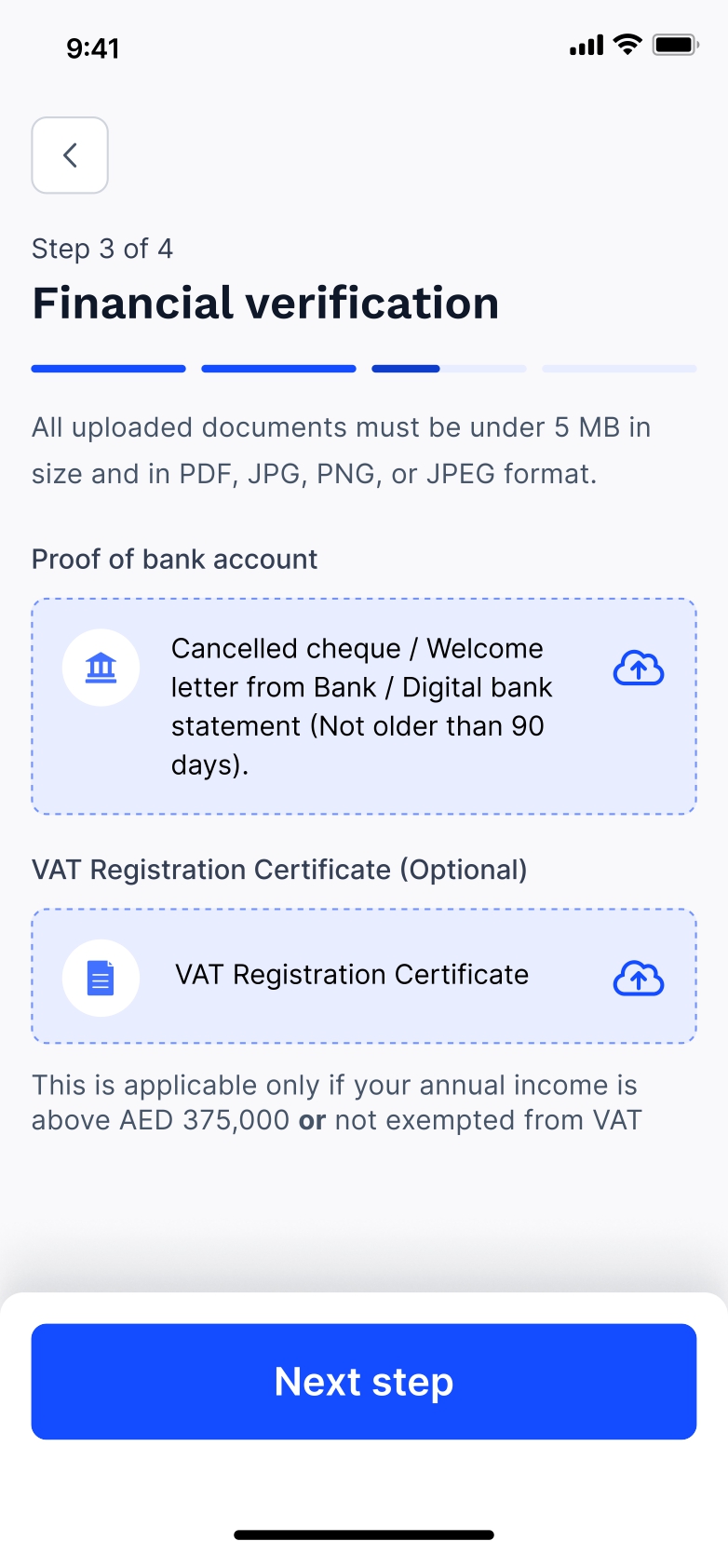
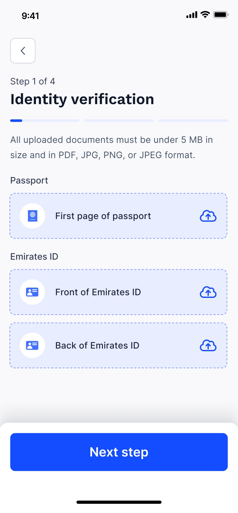
As discussed earlier, the business and finance sections are split into two parts. Users first provide their details, then upload the accompanying documents. Starting with text inputs helps ease users into the process, while pairing them closely with the relevant documents adds clarity and reinforces the purpose behind each request.
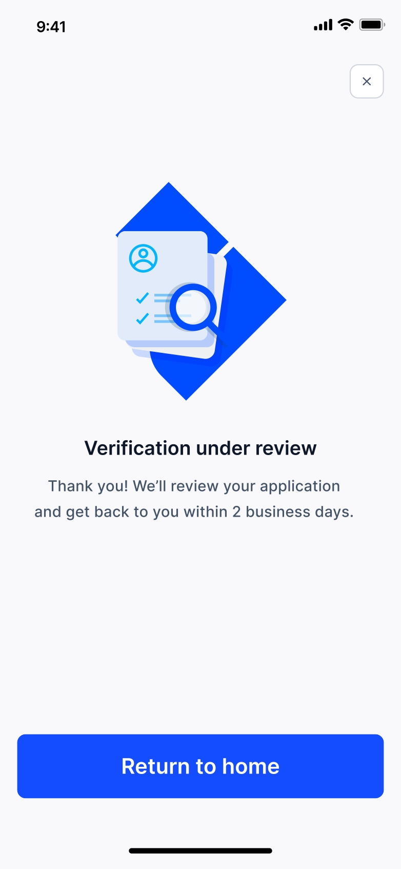
The new verification journey requires the underwriting team to review all documentation and respond with a decision. Since this is a new process, once the user completes their journey, we clearly communicate when they can expect a response.