Mamo Card: Casual Payments, Brightly Done
Opportunity
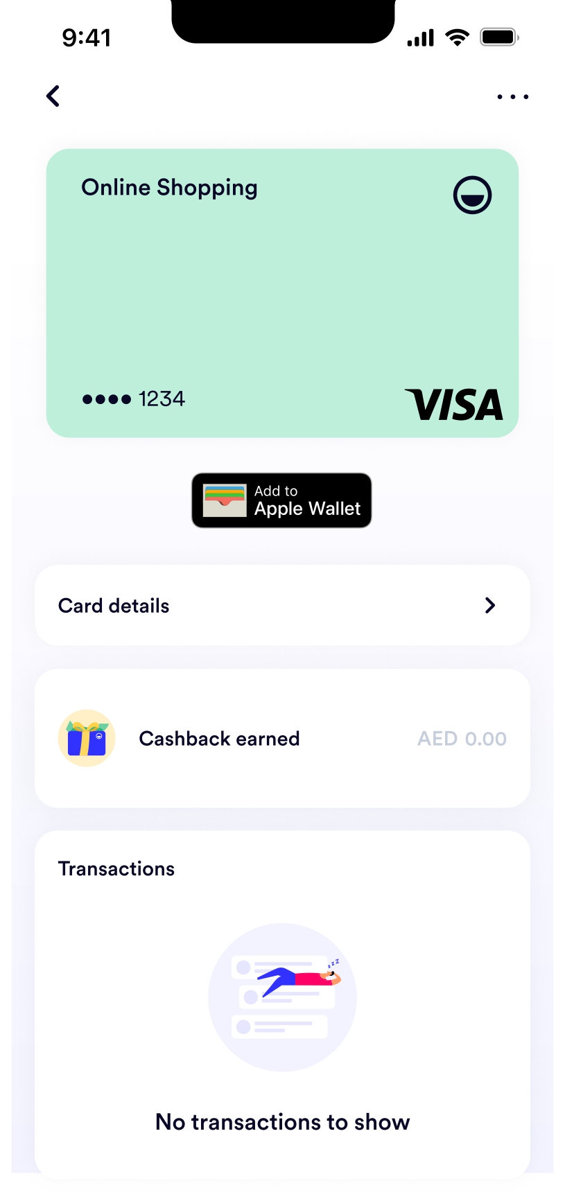
Mamo Card is a colourful, virtual spending card tied to a Mamo Pay account. The goal was to create an onboarding flow that felt just as playful and welcoming. It needed to be quick, joyful, and designed for a younger, digital-first audience.
We wanted users to feel excited from the
first tap, with smooth steps, light content touches, and a tone that matched the brand’s vibrant
personality.
Solution
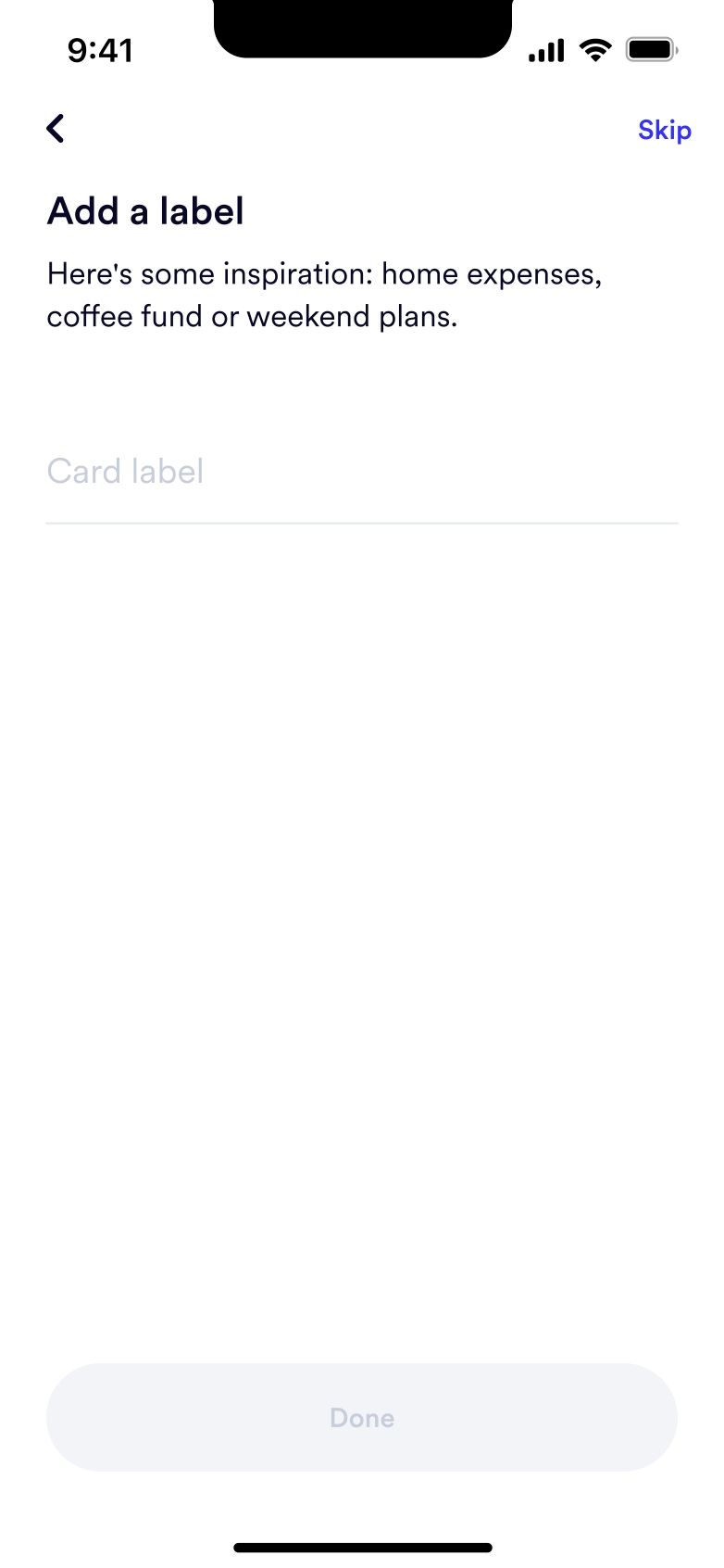
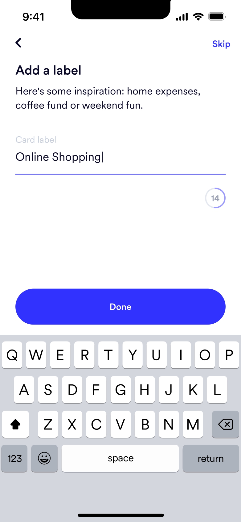
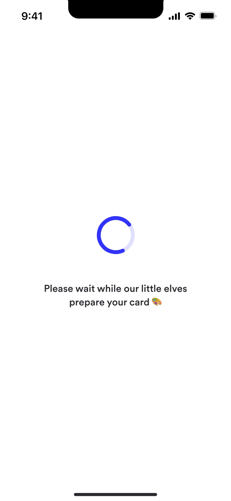
I crafted a simple and intuitive onboarding experience, with minimal input required from users. The flow was filled with playful microcopy, adding light, engaging content touches that kept the tone in sync with Mamo’s energetic aesthetic.
My Approach
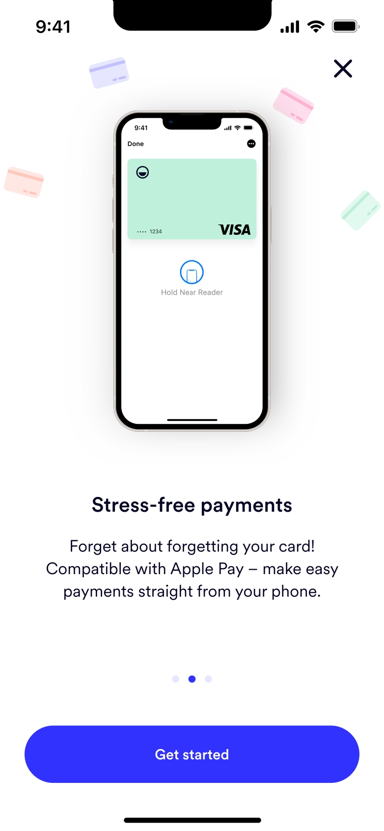
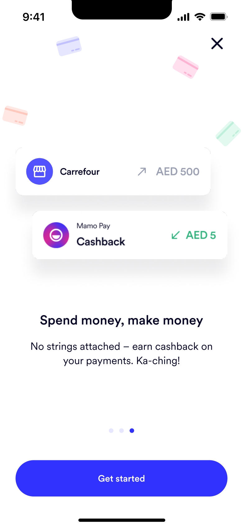
I focused on creating a content experience that felt playful, human, and fast. Every screen was written to guide users smoothly from sign-up to their first spend, keeping the tone light and positive throughout.
Case Study Quick Facts
- Project: Mamo Card Onboarding Flow
- Company: Mamo Pay
- Industry: FinTech (Digital Banking)
- Team: Lead Product Designer, Product Manager, Head of Product
- My Role: Content Designer: Led content strategy, UX writing, and microcopy for the onboarding flow
Onboarding Screens
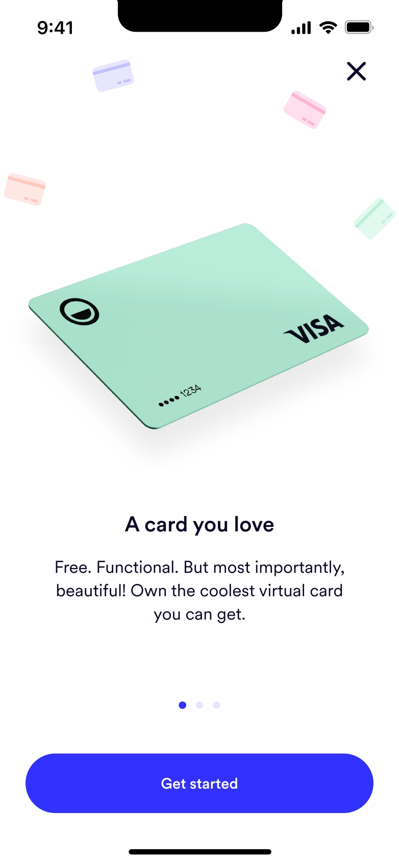
Users are first greeted with a bold, benefit-focused screen that highlights what Mamo Card offers and builds excitement to get started.
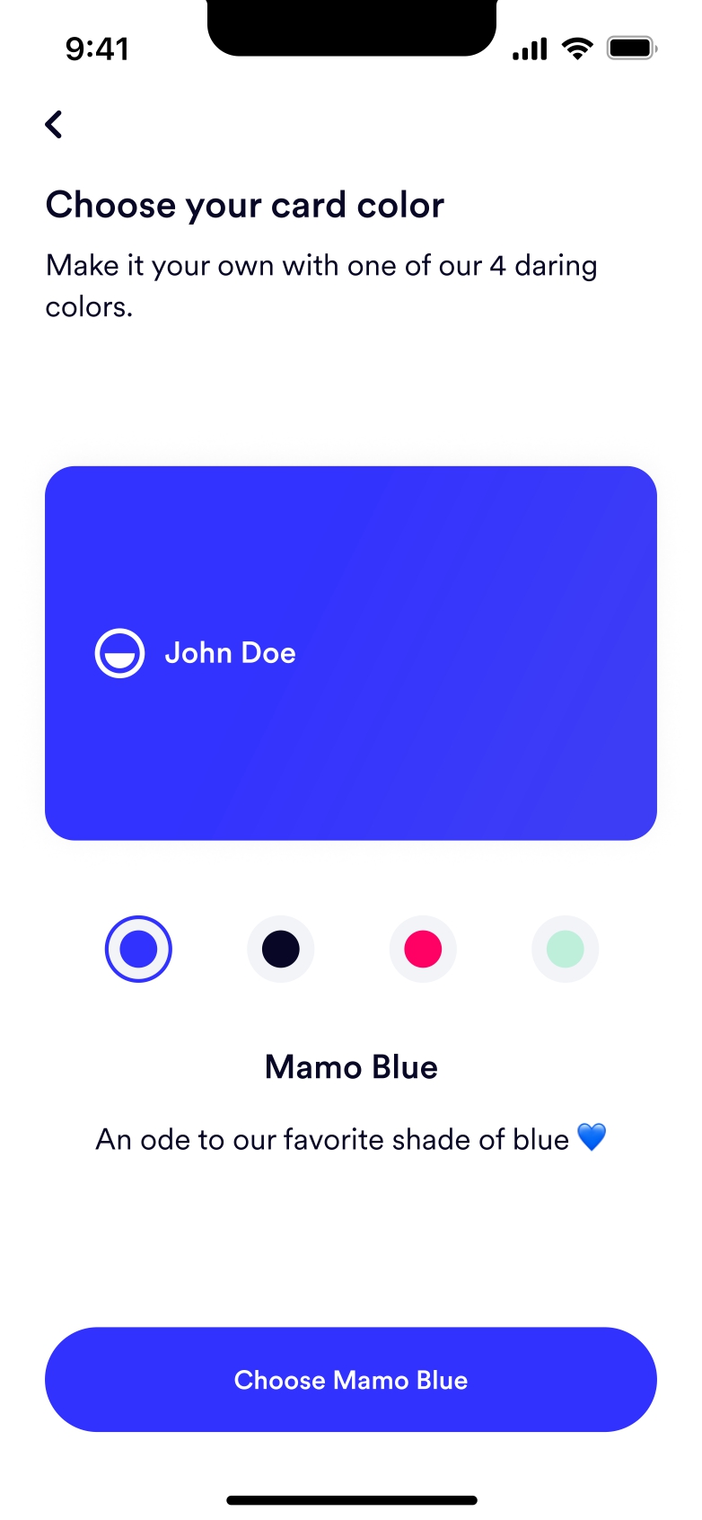
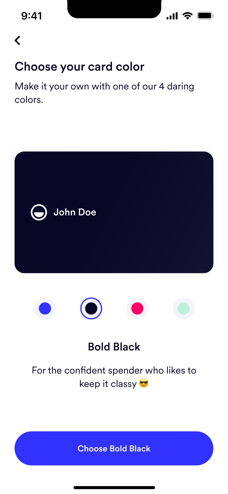
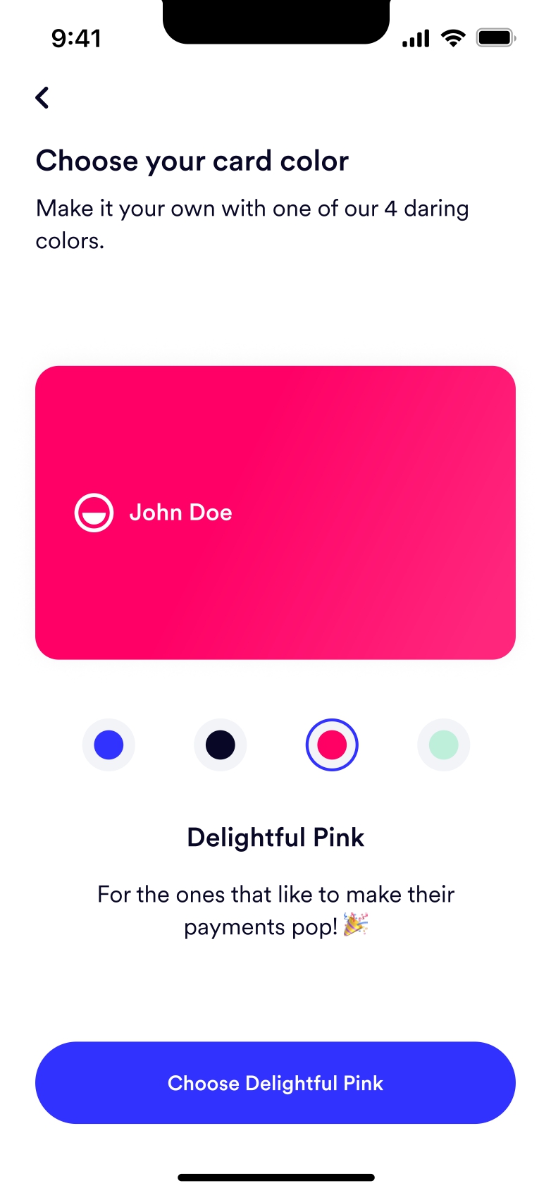
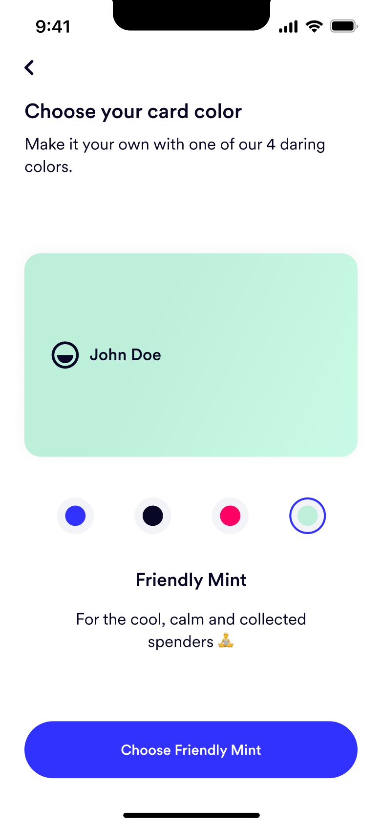
Onboarding begins with a playful step: choosing a Mamo Card color. Each color is paired with a word that reflects Mamo Pay’s brand voice, like bold, delightful, or friendly. This adds personality and a sense of fun to the selection. It’s a small moment of customization that feels personal and on-brand.
While Mamo Card never went live due to the B2C app being discontinued, this was a fun, high-energy flow I loved shaping with the team. I was involved from early ideation to final content.