UX Writing Samples
A fun little project where I prompt AI to generate UX scenarios, then take it from there by writing the case studies and designing the supporting UI mockups. This is an ongoing exercise that I’ll keep updating.
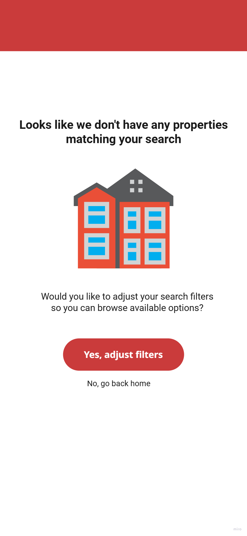
Real Estate App: No Results Page
Scenario:
A user is browsing a real estate app and has applied multiple filters (e.g., price range, location, number of bedrooms) that result in no matching properties.
Challenge:
Craft a user-friendly message that informs them of the lack of results and encourages them to adjust their filters without causing frustration.
Path to the solution:
I started by putting myself in the user's shoes. Let's say I'm Ahmed, a serious property buyer with very specific needs. When I apply multiple filters and land on an empty results page, it feels frustrating and confusing. I’m not sure if I did something wrong or if the properties just aren’t out there.
To reduce that friction, I designed a message that clearly explains there are no listings that match the exact filters. Instead of using vague error language, I offer a helpful next step: slightly adjusting the filters to widen the search. I also respect the user’s intent by giving them the choice to keep their current filters, in case they’re looking for something very specific and are willing to wait.
Imagined next steps:
To improve the experience even further, I’d collaborate with the product manager and product designer to explore enhancements to the filter functionality. One idea we could test is surfacing “near match” properties once exact matches run out, either automatically or through a user-controlled toggle.
This would help avoid dead ends and keep users engaged with listings that are still relevant to their needs.
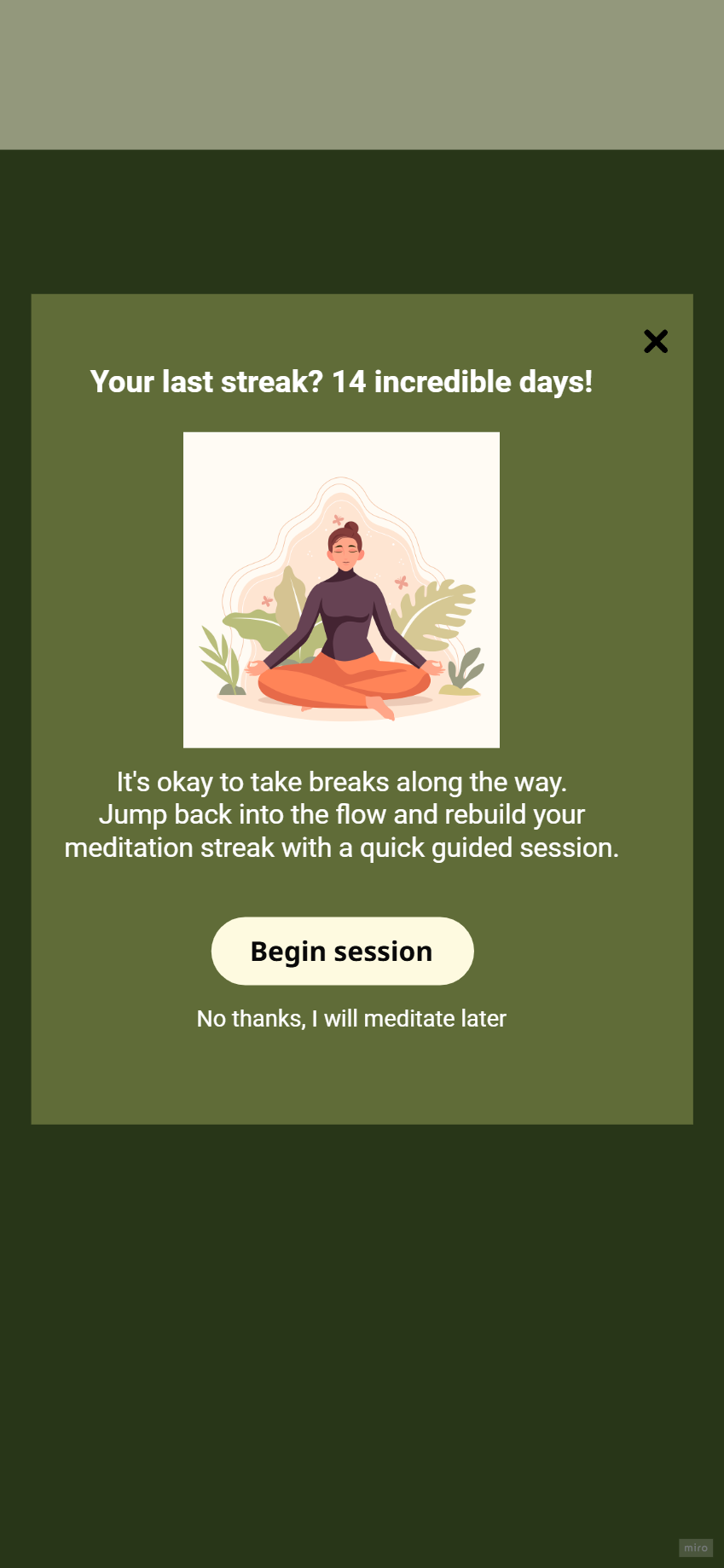
Meditation App: Streak Reset
Scenario:
A user forgot to meditate for a few days and lost their 14-day streak.
Challenge:
Acknowledge the break with empathy and motivate them to restart—no guilt. Headline: 35 characters max. Body: 160 characters max. Button: 20 characters max.
Path to the solution:
I focused on what the user might need in that moment. A meditation app should support healthy habits with a tone of kindness, not pressure. I avoided anything that could feel pushy, overly quirky, or guilt-inducing.
Losing a streak can already be discouraging, so I chose to acknowledge it with empathy. Instead of highlighting the break, I offered gentle reassurance and a simple way to restart. I suggested a short guided session to lower the barrier and help them ease back in. The CTA leads to that session, but I also added a “No thanks” option to give the user space and choice.
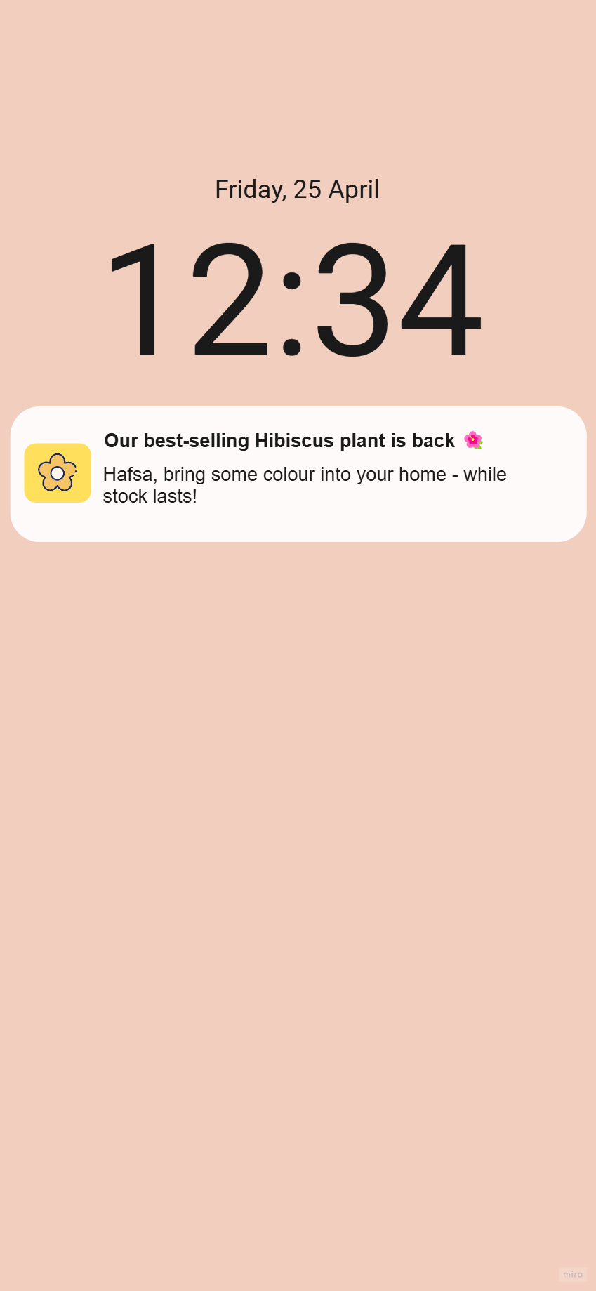
Plant App: Restock Alert
Scenario:
A user added a plant to their wishlist, and it’s just come back in stock.
Challenge:
Write a push notification that feels personal, exciting, and nudges them to act before it’s gone again.
Push text: 100 characters max.
Path to the solution:
I made sure the first thing the user sees is that the plant they’ve been eyeing is back in stock. I mentioned that it’s a best seller to highlight its desirability and create a sense of exclusivity.
Instead of repeating the same message in the body, I personalized the text by using the user’s name and inviting them to add a splash of green to their space. I reinforced the time-sensitive nature of the restock by including a gentle reminder: "while stock lasts."